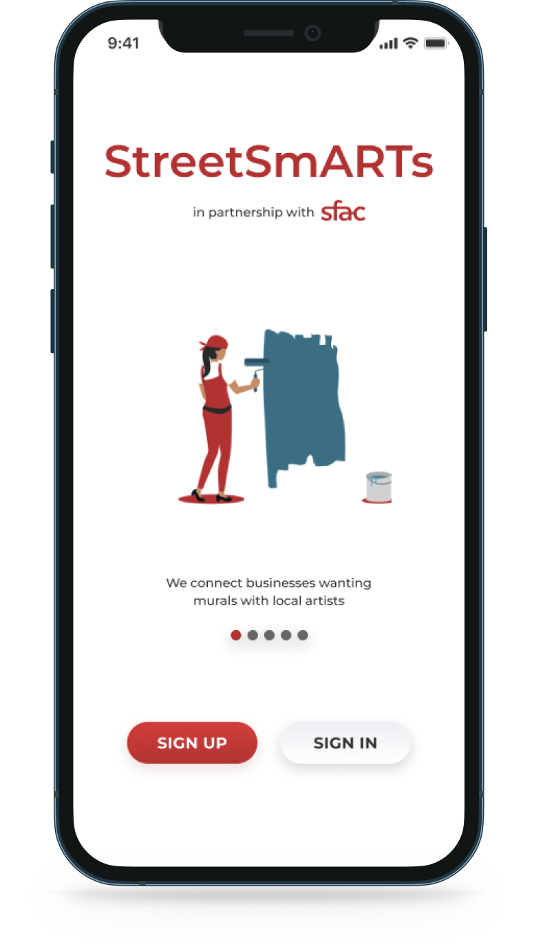
We reached out to current artists and business owners to understand how they would go about finding work or commissioning work, what their inspiration is, and whether or not a digital product like StreetSmARTs would be successful. I’ll share four quotes directly from our interviews that I feel do a great job of setting up the problem we set out to solve.
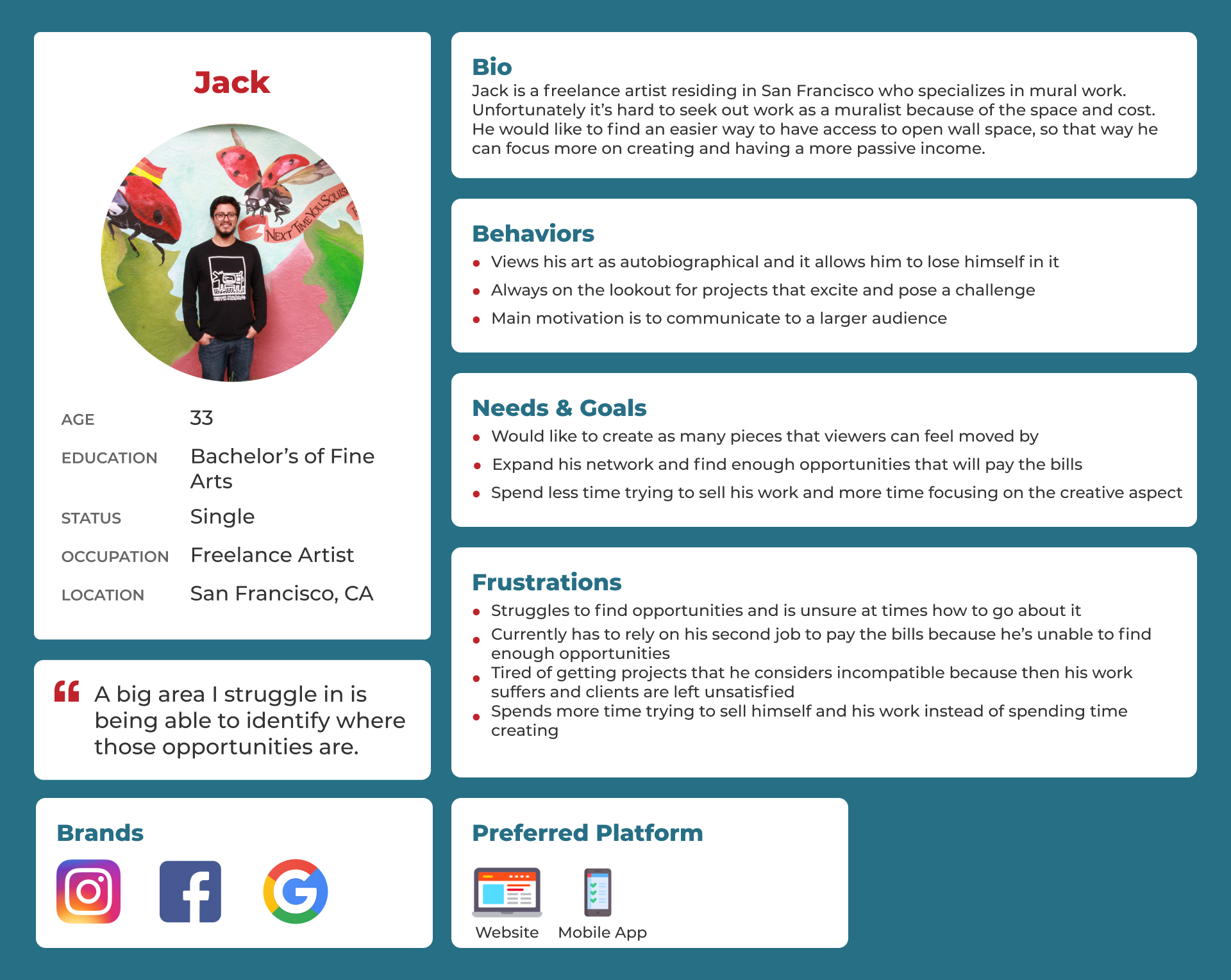
"A big area I struggle in is being able to identify where those opportunities are."
- Artist
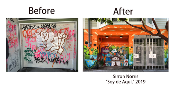
"The main motivation for me is just a broader ability to communicate to a larger audience."
- Artist
Having artists all in one place that have the skill set to do a mural is appealing."
- Business owner
"It's challenging figuring out where to even begin."
- Business owner
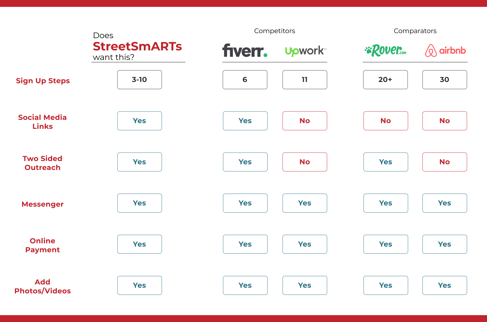
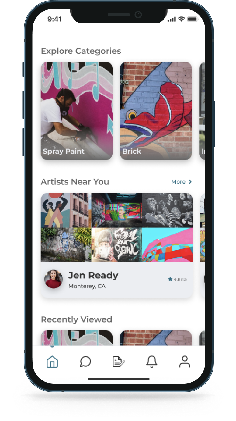
Conducting competitive analysis, we had one major takeaway: we need to have two-sided outreach. Meaning, we need to allow businesses to reach out to artists and allow artists to reach out to businesses. Both can start the conversation.
The artist. How might we help Jack spend less time trying to promote himself so that he could spend more time focusing on creating?
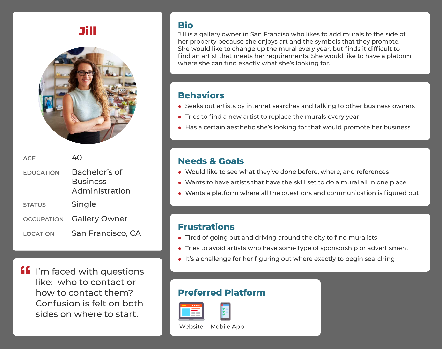
The business owner. How might we help Jill begin her search for an artist when she doesn’t know where to start?
As a remote team, we learned that sketching and sharing sketches was a little slow and not as exciting as a big whiteboard and copious coffee. However, with the time that we had, we were able to get some sketches down that allowed us to brainstorm and turn those sketches into mid-fidelity wireframes.

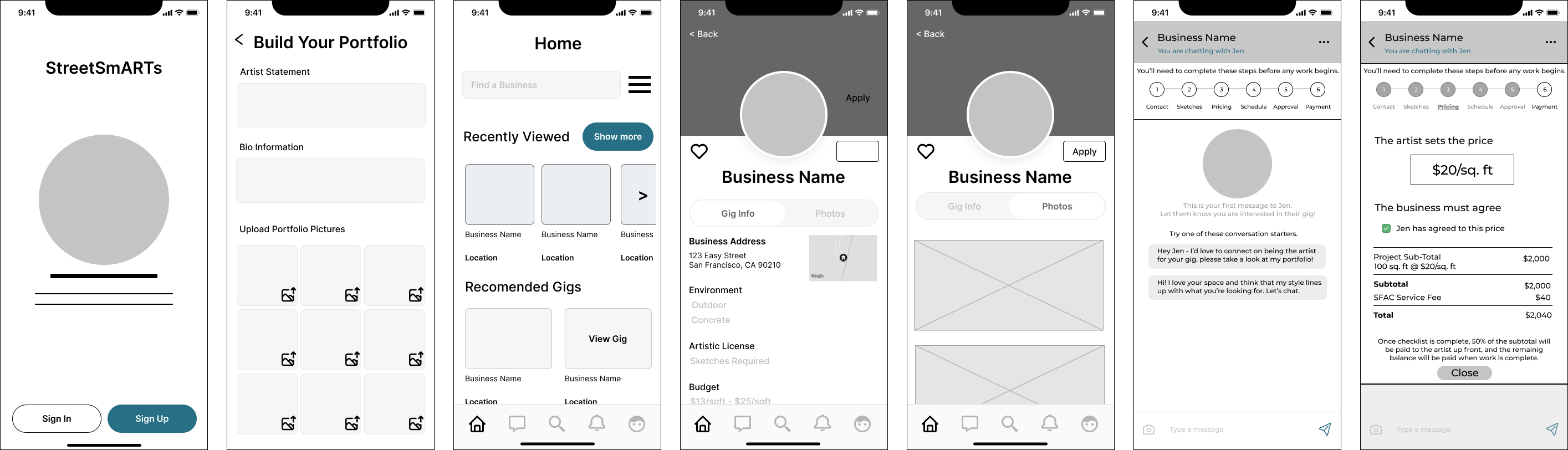
This ideation and wireframing went really well until we got stuck on how we end the journey for both personas — where the users will negotiate and pay. We came up with a potential solution that we’d test heavily in usability testing.
We came up with a potential solution that we’d test heavily in usability testing.
We gave a few tasks to participants to complete, as both the artist and as the business on both mobile and desktop. We learned quickly that the tester was far more comfortable the second time around with the second persona, and even more comfortable on desktop. So I would consider only testing one persona and one device at a time in the next round of usability.
Main takeaways from testing:
But we anticipated #3. We knew that where we placed it, how it was laid out, the entire concept was totally off, and that was confirmed by users.
Keeping in mind the issues that were discovered in the mid-fidelity wireframes, we started designing to resolve them and reinforce the momentum of what went well.
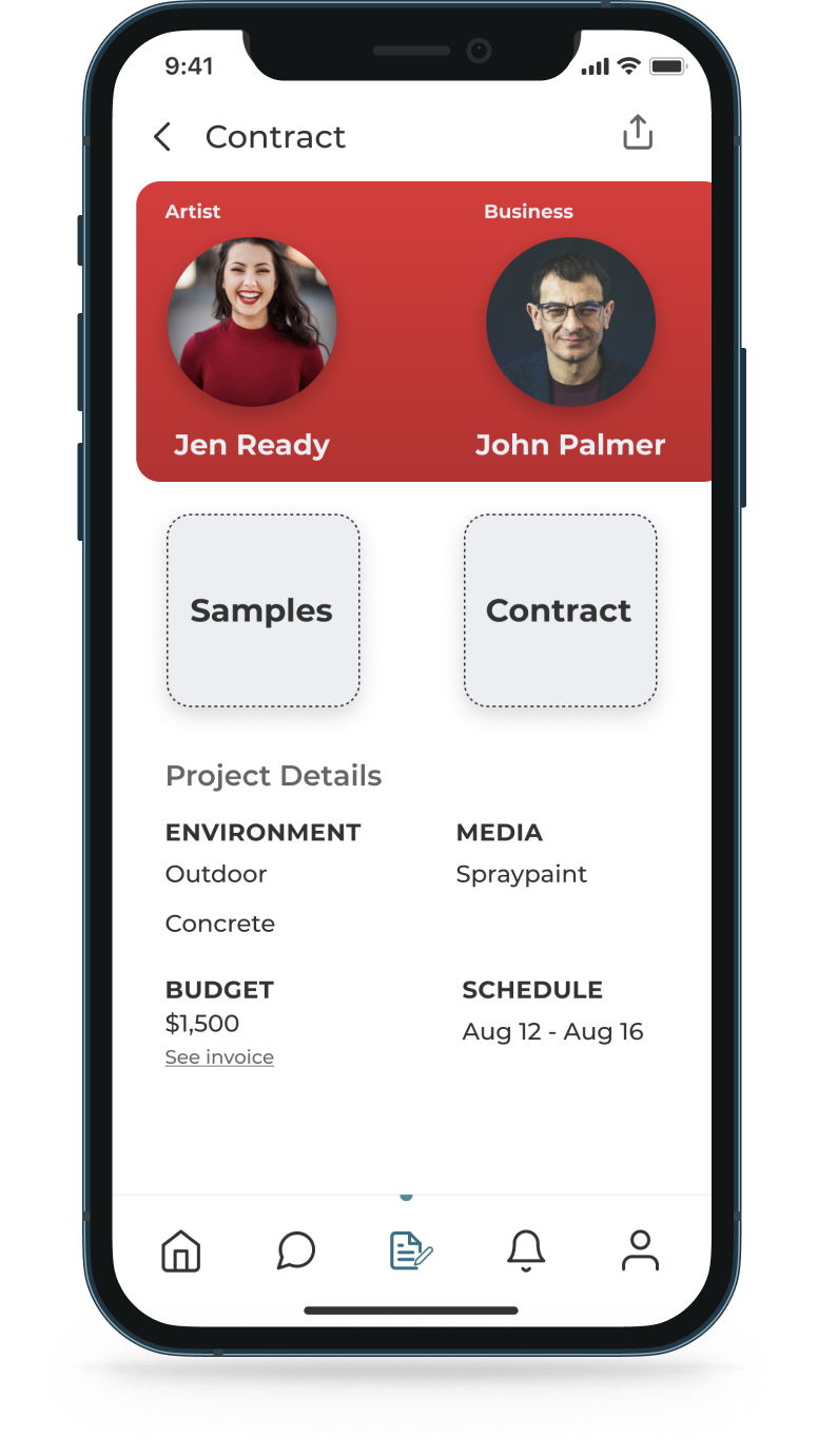
The results of the testing for the negotiate and pay aspect of the product allowed us to make a foundational change.

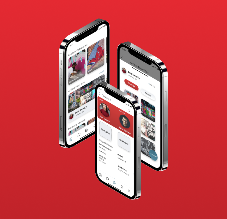
Making the contract accessible in two places, as well as making contracts part of the greater information architecture - users were 50% more successful in completing usability tasks. As well as eliminating confusion about why contracts were in the chat.
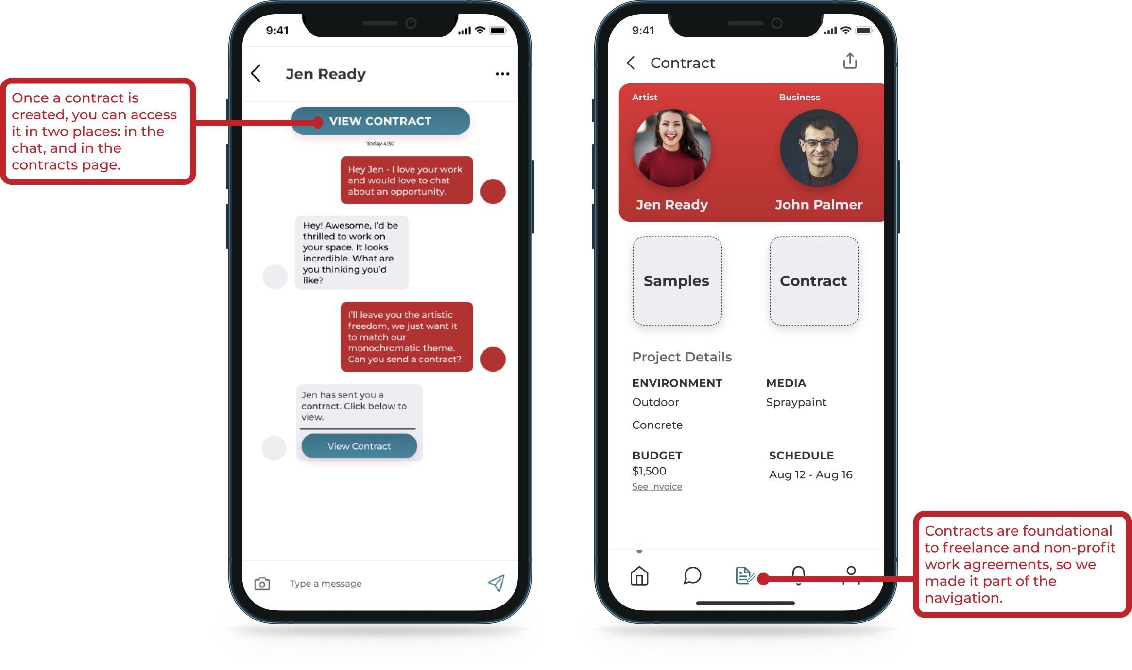
In the art community, and especially in non-profit work, some sort of contract must be written to ensure fair practices and payment. We included this foundational change in our main navigation and provided quick access to it in the messenger.
We tested this new solution with users and it tested heads and tails above our first solution.


Given the time constraints, we were not able to test the desktop version of the hi-fidelity mockups, so we would want to confirm that the navigation we adjusted was sufficient. Additionally, we would really want to explore the double-persona aspect, meaning an artist that is also a business owner. How might we allow one user to be both personas simultaneously? Finally, since we designed mobile-first and scaled to desktop, we would want to ensure the design was fully responsive.
This was my first time working on a team on a design project, an incredible learning experience for me and my team. Here are the four big learning moments I had:
