Redesigned the JSH-Online subscription and product detail pages to improve clarity, surface pricing earlier, and better communicate value. This project, in conjunction with the metered paywall, contributed to a 3% increase in years JSH-Online Subscriptions.
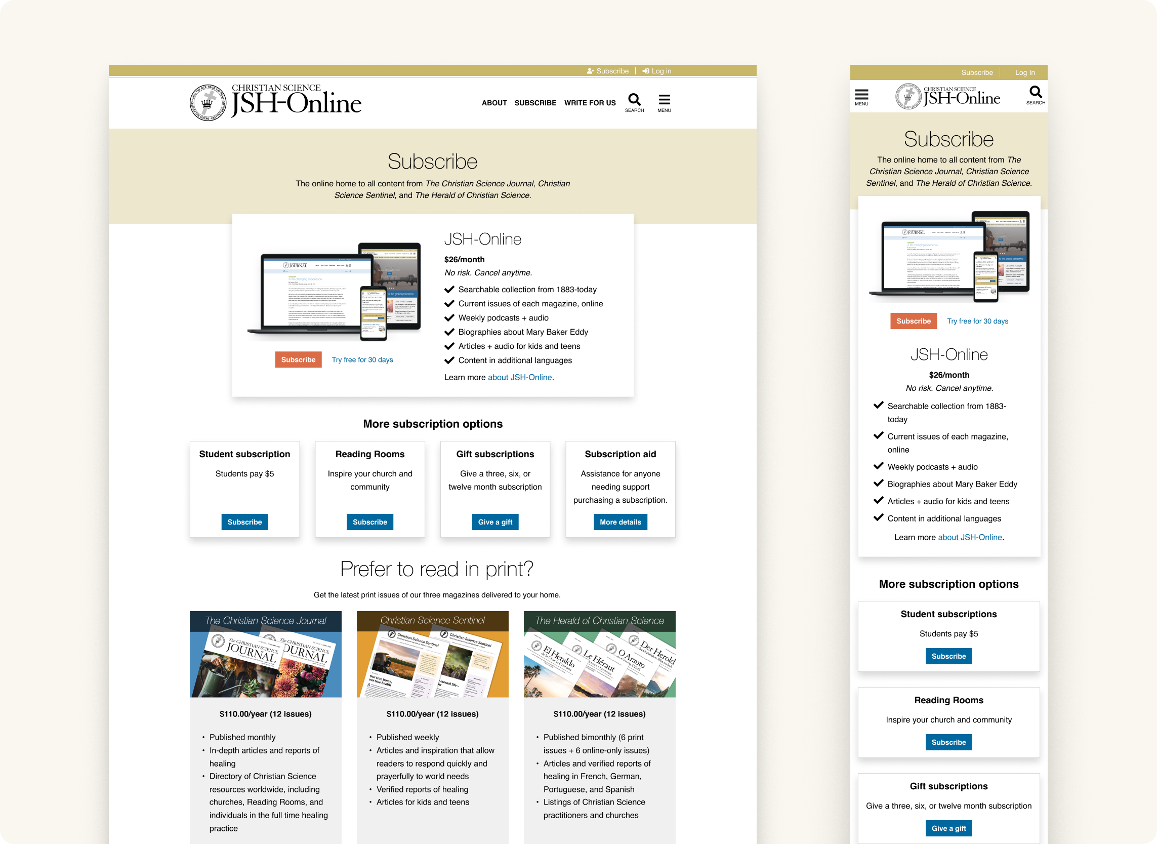
JSH-Online’s old product pages created confusion. We saw this in both qualitative research and subscription performance. We needed to clarify what users were buying, surface value faster, and reduce the cognitive load across the experience.
The existing product pages presented several challenges, including a value proposition centered on organizational structure rather than user benefits, hidden pricing until checkout, overwhelming text-heavy layouts, outdated iconography, and a lack of clarity regarding the relationship between the three distinct magazines (Journal, Sentinel, Herald) and JSH-Online.
We found that users needed several pages just to understand what they were buying. Even then, there were still questions about what was included, what “JSH” referred to, and whether they were being redirected to a different website. The wall of text worked against trust and comprehension.

Rapid prototyping and collaborating with the research team, we were quickly able to validate a lot of our hypotheses in this improved flow, and learned how we could continue to make it better. We found:

