Redesigned the subscription and access model for JSH-Online’s two digital magazines. Delivered a clear, consistent experience that increased new subscriptions by 31% year over year and grew total subscriptions by 2.6%.
While this work centered on subscriptions, many of the same principles apply to membership models, including building trust, clearly communicating value, and encouraging ongoing engagement.
I led UX from discovery through launch, collaborating closely with research, product, engineering, and stakeholders. I facilitated design workshops, conducted multiple rounds of moderated usability testing, created prototypes in Figma, and worked directly with engineering to ensure the experience translated accurately into code for both brands.
Our research team surveyed existing subscribers to understand why they subscribed. While many responses reflected a straightforward subscription mindset, there was also a strong sense of belonging and identity tied to the publications. This influenced how we approached messaging and calls to action.
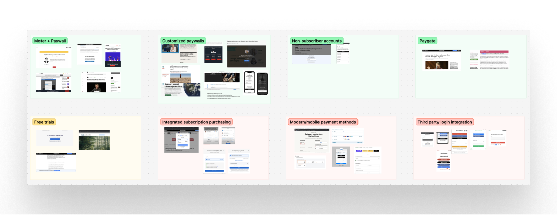
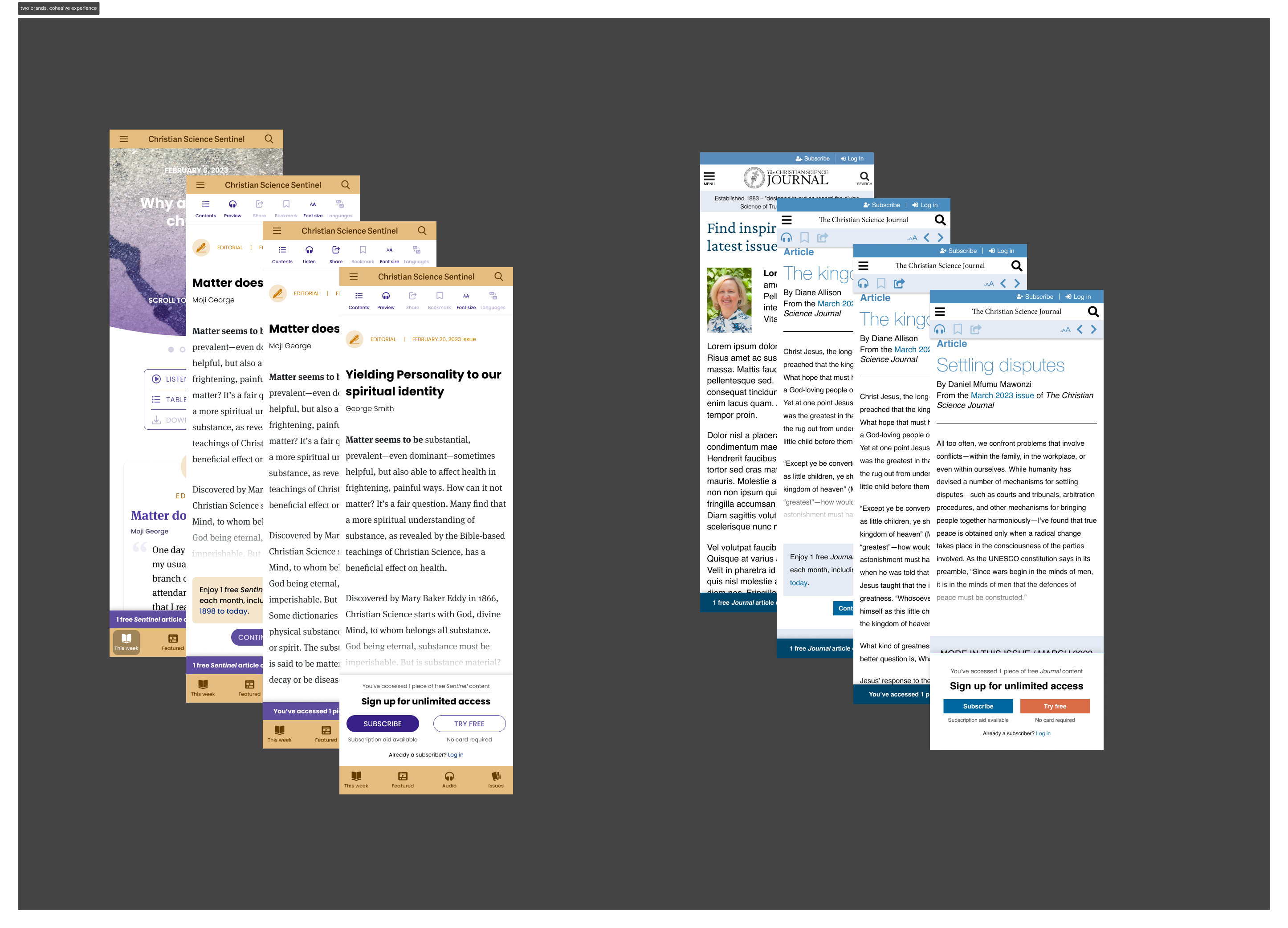
We explored multiple paywall models and, after reviewing industry examples and stakeholder needs, chose a metered approach. Readers could access one free article per magazine each month. This balanced access for casual readers with a clear incentive to subscribe, and it mirrored some of the access strategies used in membership models.
We tested early wireframes with users to answer key questions. Do they understand the meter? Do they know what counts as content? Do they understand that reading and listening to the same article counts as one use? Testing revealed confusion around button labels, and meter visibility. We addressed these in final design refinements.

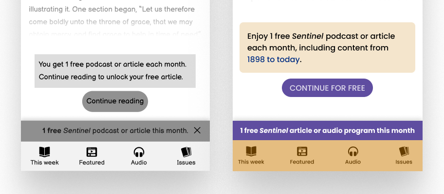
We created and tested high-fidelity prototypes, refining the experience based on user feedback. After launch, A/B testing revealed that removing the warning message actually improved trial signups and quality content views. This was a surprising learning, as we placed this message there as a courtesy to our low-tech-literate user base. However, we were grateful to be able to remove something that was limiting access to the content.
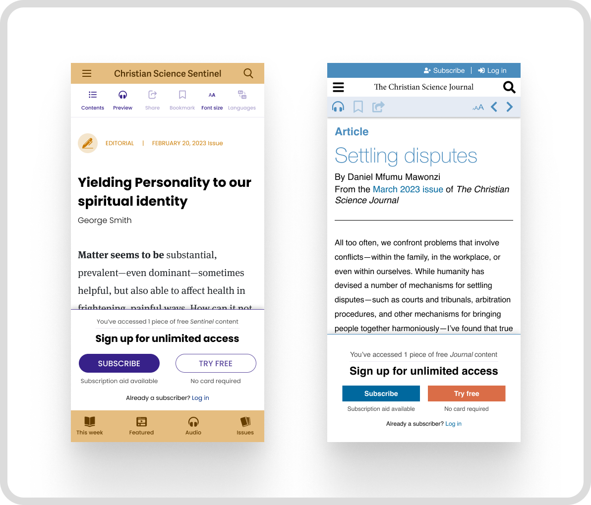
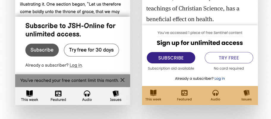
We also worked with our marketing and business teams to shape the Subscribe and Free Trial pages (more on those pages here). In the paywall we added details about what readers get, emphasized that no credit card was required to start a trial, and made sure all messaging felt consistent across the site. The copy in the paywall was critical to our success, we needed to balance trust, ease of next steps, and clarity.
We introduced a three click, Free Trial sign up flow that users could click on from the Paywall. This added an easy way for users to continue reading content with minimal friction.

One of the bigger challenges was implementing this across two separate magazine brands with different styles and systems. I used a design systems approach in Figma to create flexible components that respected each brand’s voice while delivering a unified experience. This brought consistency across the subscriber’s experience, even if the look of each magazine is distinct.
We also A/B tested the content warning message that let readers know they were using their one free piece. While testing showed that people noticed and appreciated the message, removing it actually led to better results. Trial signups and high-quality content views both increased. These tests occurred well after we understood the impact of the initial launch of the metered paywall. Ongoing tests include varying the CTAs, using dynamic logic to make offers for readers that are known, and more.
This project reminded me to trust real-world behavior more than polite feedback. Readers told us they liked the warning message, but their actions said otherwise. The simpler version worked better.
I also saw how important it is to balance emotional motivation with practical clarity. Readers weren’t just subscribing to unlock content. They were subscribing because the content mattered to them. That shifted how we approached the tone and language throughout the experience.
